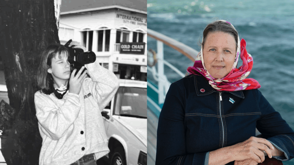
After a year-long brand research, identity, and strategy effort supported by a SAS alum, ISE is updating its marketing materials, logo, and colors
For over 60 years, Semester at Sea has redefined higher education by taking students around the world on a journey that alumni describe as “life-changing,” “epic,” and “one-of-a-kind.” The program fosters globally minded citizens through immersive, hands-on learning that extends far beyond the classroom.
Today, we’re unveiling a refreshed brand identity that leans into this reality. Informed by a comprehensive audience and alumni research project, this new identity includes a slightly revised logomark, a new color palette evocative of the waters and landscapes our voyagers and crew encounter, and a clearer, more confident way of talking about the Semester at Sea experience.
This work is the result of a nearly year-long research, identity, and strategy process led by Farrynheight, a boutique branding firm that has worked for brands like New Balance and W Hotels, but also smaller startups. The firm was founded- and is led- by SAS alum Farryn Weiner.
The changes to our design language are evolutionary, not revolutionary. We’ve refined—not replaced—elements of our look to better reflect who we are today and to ensure we’re ready to connect with the next generation of voyagers.
Most importantly, this brand refresh is focused on telling meaningful stories about what our voyagers experience and gain from their semester during our program.
This new framework, and the tools provided by our partners, will help us tell stories with more clarity and impact. These won’t just be stories from students, faculty, staff, Lifelong Learners, or crew members on the voyage. They need to be your stories—your memories, your milestones, and your connection to Semester at Sea.
So while we’re excited to begin introducing these updates to you, this is just the beginning. Our next step is to invite you into our storytelling by giving you meaningful ways to share your own SAS story. We’ll be in touch!
What we’re introducing today:
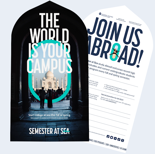
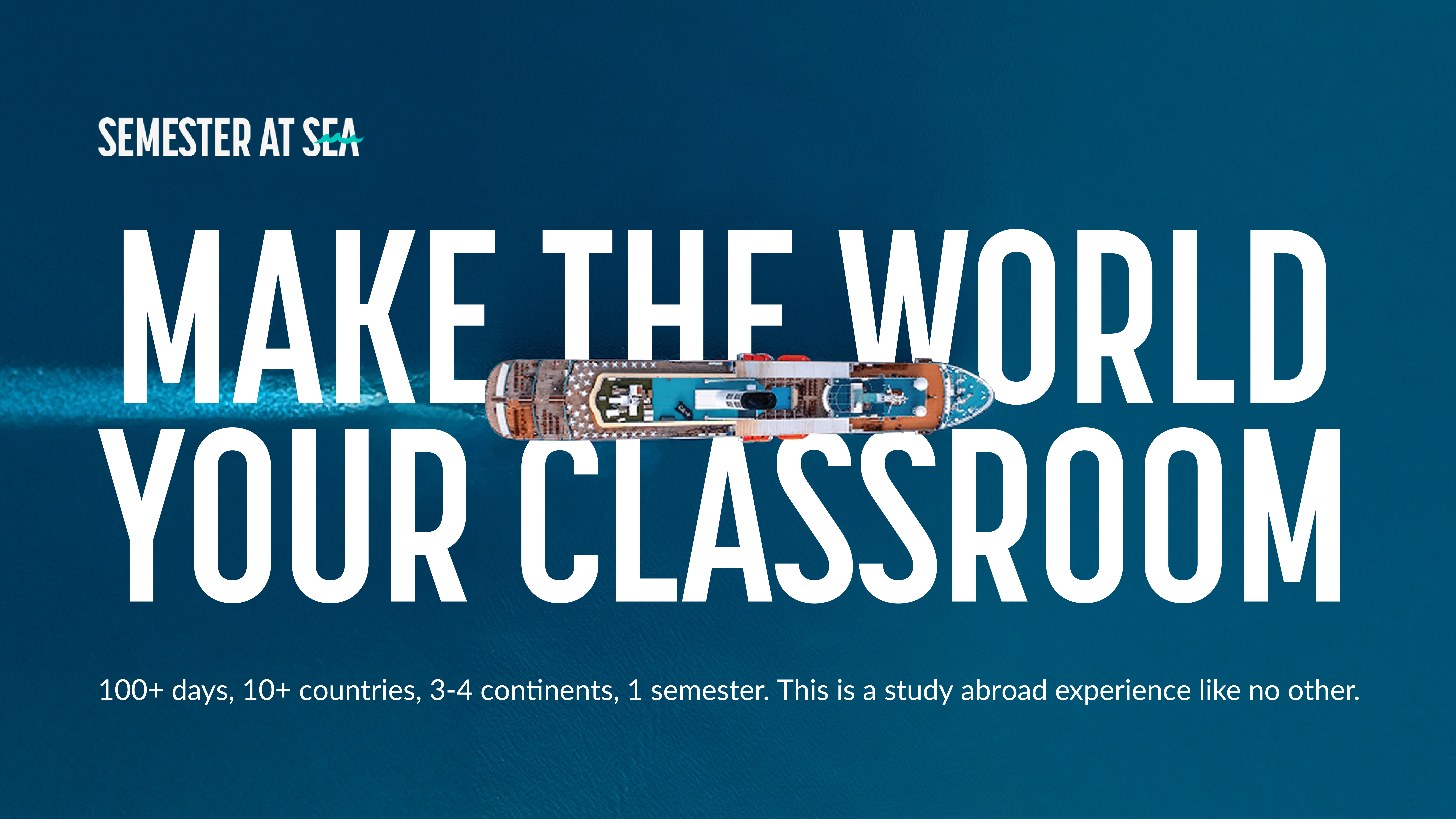
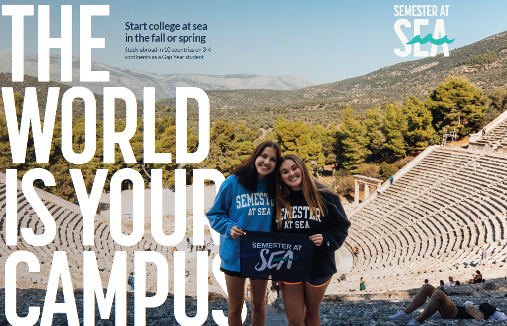
- New advertising creative that leans into showing just how eye-popping and expansive, but also deeply personal, our program is.
- A renewed focus on time spent on land and at sea: Students (and the TikTok algorithm) tell us the same thing: they love seeing the ship. But focusing only on the ship can create the impression that our program happens solely at sea. As we create new materials and share stories, our brand narrative and design tools guide us to reflect the full scope of the Semester at Sea experience, both on the ship and around the world.
- A program for nearly every major: In our research, we learned that nearly half of prospective students assume SAS is only for students studying marine sciences (another 20% thought we taught students to sail). This finding also influenced our decision to add green, sand, and sky tones to our color palette.
- A refined Semester at Sea logomark: Hopefully, the logo on our website looks familiar. That’s intentional. We retained the essential elements of the 2022 redesign, but made small adjustments to improve readability, make the type more enduring and easy to use, and create a more consistent representation across digital and physical platforms.
What’s next:
- New apparel choices: The CSU Bookstore will soon be adding new apparel in our refined color scheme and featuring our refreshed logomark.
- A focus on alumni stories: As noted above, potential students and families want to know what our alumni and their families have to say about the program. We’ll be reaching out much more often to ask you to share your unique story.
Q&A
Where can I see more of this work?
Our website and social media channels will be the first places to see some of the new work. Video footage from our introductory ad is running on our main page and can also be seen here.
Why make such subtle changes to the logo?
There are a few reasons. The move in 2022 to a new logo was intended to modernize our color palette and make our brand identity (logo) more readable from afar and online. It was also aimed at giving us another eye-catching brand element: the wave. It did this very well. In the years since, the logo has been seen more than 73 million times through paid advertising, not to mention through millions of social media posts, on our website and materials, and more. It’s become recognizable to our target markets (students, families, and university partners). We didn’t want to lose that brand equity or momentum by making a dramatic change.
We very intentionally stuck with what was working (brighter colors that are distinguishable from competing programs) while refining the handwritten “SEA” script that proved difficult to use in some cases, including horizontally on printed documents, social media profiles, and some apparel.
Will all of the logos change at once?
No. As the logo revision was subtle, things like the logo on the MV World Odyssey’s funnel will not be changed this year but will be replaced on its regular replacement cycle. Even as we restock the CSU Bookstore and ship store with new apparel featuring the revised logo and colors, we will continue to sell what inventory remains featuring the previous logo.